Intrepid: Mobile app
featuring scan technology for self guided tours.
Duration: May - June, 2018
Platform: Mobile
Design tool: Adobe XD
Client: Intrepid Sea, Air & Space Museum
Institution: KBCC Cuny Techworks
Role: UI Designer, UX Researcher
Overview
My client, the research and development team of the Intrepid Museum wanted an app concept that was clear, highly compelling, creative and a pleasure to interact with. . My objective was, to find a way to use technology with user journeys to give the visitor the freedom to roam the facility with self guided options.
Challenge
Create a user friendly application, that perfectly supports the interpretation of the content and nature of the museum experience
Vision
Implement user-friendly features, to empower users to easily access information and important facts about exhibits, enriching their overall experience and fostering a deeper understanding of the content through using their smart device.
User target audience
Pain points
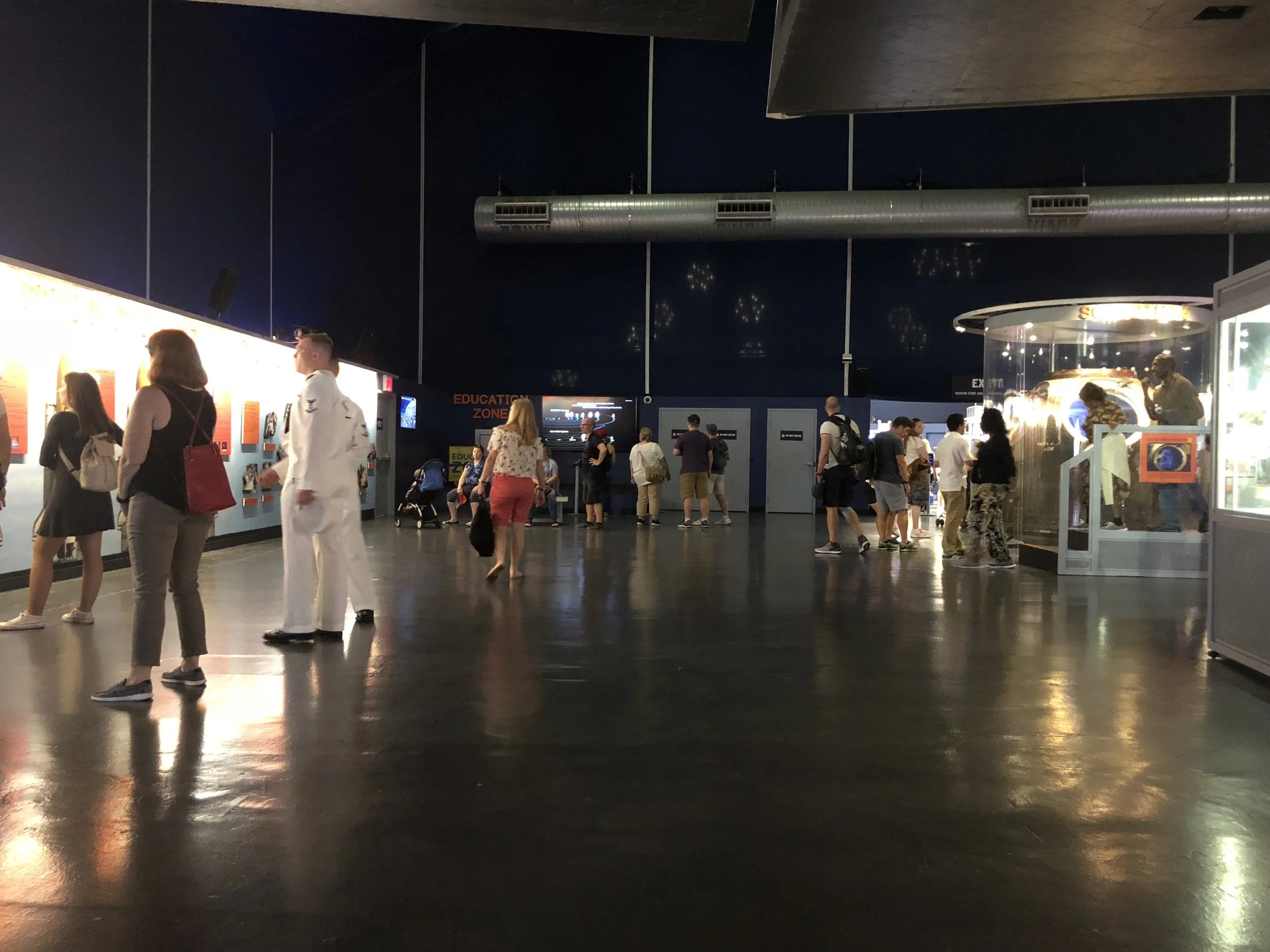
Visitors did not understand navigation throughout the Intrepid due to lack of signs and not understanding signage.
Visitors spoke a foreign language that was not listed on signage.
The cost of entry, visitors were not interested in purchasing add ons (eg. guided tours or audio tours).
Visitors preferred the exhibits to be more interactive (being able to touch and see inside the exhibits) .
Provisional Personas
Competitive analysis
The Metropolitan Museum (mobile web)
Clean design
Social media links are on welcome screen
Call to action buttons are placed in standard areas, doesn't crowd the screen
The museum's featured attractions are timed to change on the landing page
Landing screen is long-scroll design
Readable typeface
American Museum of Natural History
Nice color scheme
User flow of ticket purchase is easy to understand
Some call to action buttons are too small
Madame Tussauds Wax Museum (mobile web)
Very strong overwhelming colors
Welcome page is long-scroll
User is greeted with short enticing video
Image and fonts are too closely spaced, and a bit confusing to read
Journey map
Paper wireframes
User flow for first time user
Application layout and user flow
User flow
High fidelity Landing screen
Challenge 1
Menu tab
Challenge 2
Search button
Challenge 3
Landing page layout
Challenge 4
Scan feature
Challenge 5
Map feature
Takeaway
Positive
-Enhanced Visitor Experience:
Interactive Learning: Scanning QR codes or NFC tags provides instant access to multimedia content, including videos, audio guides, and detailed information.
Personalized Tours: Users can customize their tour experience by choosing specific routes or topics of interest.
-Convenience and Flexibility:
Self-Paced: Visitors can explore at their own pace, spending more time on areas of interest without feeling rushed.
-Cost Efficiency:
Reduced Staffing Needs: Fewer tour guides are needed, potentially lowering operational costs.
Scalable Solution: Once developed, the app can serve an unlimited number of users simultaneously without additional costs.
-Increased Engagement
Social Sharing: Users can share their experiences on social media, increasing the visibility and attractiveness of the tour.
-Data Collection and Insights:
Feedback Collection: Visitors can easily provide feedback through the app, helping to enhance future tours.
Visitor Analytics: The app can track visitor behavior, providing insights into popular exhibits and areas for improvement.
-Environmental Benefits:
Paperless Solution: Reduces the need for printed materials, contributing to environmental sustainability.
Negative
-Technical Issues:
Connectivity Dependence: Reliance on mobile data or Wi-Fi can be problematic in areas with poor connectivity.
-User Adoption and Accessibility:
Learning Curve: Some visitors, especially those less tech-savvy, may struggle to use the app effectively.
Device Dependency: Visitors without smartphones or with limited battery life may not be able to use the app.
Content Management: Keeping the tour content up-to-date and accurate requires continuous effort.


